Preface
Another day, another guidepost from Kodework. Today’s post will cover some of the most commonly asked questions about mobile app design. We, at Kodework truly believe in educating our readers, so that you understand the basics of mobile app development, through this mobile app design guide.
We are able to post a mobile app guide like this because we work with reputable clients, across the world through our offices in Norway and India. Whether you are a beginner or an expert, this guide benefits everyone.
Looking for a smart re-branded website design to attract more leads? What about user-friendly mobile app design? Call +91 750 620 3013 or write to [email protected], to get in touch with our team of experienced web developers.
1. Introduction
Mobile app design involves the interaction between the user and a mobile device. Being a mobile development company, we are obliged to cover topics ranging from mobile UI design, basic steps when designing a mobile app, best practices for mobile app design and a look at different mobile screens.
This post won’t cover queries such as,
“What does a mobile app design agency do?”
“What are the types of mobile app design templates?”
“Which is the best mobile app design tool?”
“What is the meaning of motion UI design?”,
We will cover all the above-mentioned questions on Kodework’s subsequent posts.
We would love to gain some feedback from you as to how we can make this post even better.
Feel free to communicate with us in the comment box below. We are a bunch of passionate mobile and software professionals who build interactive and compelling mobile apps. We want to learn and teach.
2. What is the meaning of mobile UI design?
When you swipe through your smartphone, checking out apps that you probably can’t interact without, you are technically paying homage to a UI UX designer somewhere who visualized you doing just that.
Mobile UI design focuses on how a user can interact with a smartphone or tablet’s mobile applications. It tries to lay in order all the content, features and functions. Mobile UI design is different from web UI design. To better understand web UI design, check out this guide to web UI design.
Mobile UI design is bounded to touch screen controls and smaller screen sizes. This means that every mobile UI designer needs to work under these constraints to ensure consistency, readability, and usability.
Controls are usually hidden until acted upon to be revealed. Symbols are used more as there is not enough space to display text labels. Mobile UI design
Even if your mobile UI is great, an abysmal UX can reduce a mobile application to a decent one. Mobile users nowadays expect a mobile app with quick-loading, easy usage, and smooth interaction.
3. What are the best practices for mobile UI design?
Adopting the best practices for effective mobile designs is every mobile app designer’s objective. Some practices that work best are:
Ensure the content window size is maximized. The user interface should not dominate the small screen size. Remember, that content and apps need to be facilitated foremost.
The mobile app layout, its commands, content should all be suited to the mobile operating system’s colours, composition, and placement. Consistency is key, as the user should not be wasting time in understanding the interface.
Commands or controls within the design should not overwhelm the user. The content displayed on the app must be clear for viewing or interacting. Likewise, click points cannot be too narrow or small. This can lead to unwanted clicking of neighbouring elements.
Mobile UI Design Tutorial by Tuts+
4. What are some tips to keep in mind when designing a mobile app?
A question that gets asked repeatedly. Designing a mobile application involves more than simply deciding what colours or font go into the app.
Here are some general steps that UI and UX designers need to follow are:
Mobile app developers need to understand who will be using the app. Understanding users is the first step. This research will include studying the target audience.
Is the app solving any problems? Is the mobile app improving the user’s lifestyle in any way? What are the app’s technical capabilities?
Next, look at the app features. Which features would suit a particular set of users? The app must be a useful tool instead of an application that promises but doesn’t deliver.
“If it’s not an iOS app, then Android app design works best”. Don’t think like that. Find out if there are enough users within your target user base with Android smartphones.
Understand the different operating system versions. Understand the app specifics and device types.
A mobile app that does not abide by strong mobile app design principles will fail. The competition is fierce for any product app. Avoid any UI feature surprises. Ensure the UI is user-friendly, responsive and intuitive.
Make sure the app takes advantage of the complete screen space. Position the elements within a natural hierarchy. Keep in mind user navigation and place only relevant elements. Think how would a right-handed user operate? Are the elements within reach of their respective thumbs?

Make sure you take in to account usability and readability when deciding on colours, styles, icons, buttons, and fonts. Are the fonts visible over different resolutions? Keep colours contrasting to differentiate one element from another. Avoid clutter, always.
Most users are already familiar with how mobile apps function. Avoid confronting them with UI elements that don’t behave the way they expect it to. Whenever possible, make use of built-in devices and standard controls.
Also remember device constraints such as screen size, memory, storage, processor speed, battery life. Not all handsets possess the same specs. For enterprise mobile apps, data is the priority. Understand how push notifications work. Allow users to rate the app.
The content should be user-focused and clear. If an element is not intuitive, provide simple instructions.
Consider data management within the app carefully. Will user data be made available as an online service? How will the app connect to WiFi? How will it react to a lack of connectivity?
What steps are being taken to safeguard the user’s data? How will the app address security issues such as authorization and authentication? Turn to virtual private networks, TLS and SSL encryption, to ensure security mechanisms are in place.
Test your app well. Appreciate user feedback and work on it to improve your application’s flaws.
Kodework tip 1: Keep market needs in mind
5. Which are the different types of mobile screens?
A top mobile app development service must be willing to deep dive into understanding the practicality of the mobile app design. The 7 essential mobile app screens are:
1. Splash Screen
A mobile app splash screen is the mobile app’s first impression of a new user. It is an app screen that loads the moment a user opens the mobile app. As a result, the mobile app design needs to be minimalistic for a splash screen.
The name of the app, the mobile app logo, and the app slogan are what one sees over the splash screen. To ensure that the splash screen does what it does best, any top mobile app design agency will place the elements in the middle of the screen.
The screen appears for a maximum of 8 seconds. The app loading progress bar keeps impatient users informed of the impending app launch happening soon.
2. Home Screen
The mobile app home screen is an important part of any mobile application. It is the user interaction screen usually containing the most options of the handy mobile app.
They are designed based on the type of product and purpose. Sometimes mobile apps are built with the main screen wherein a search field is provided. This allows users to easily search, and navigate towards the content they want to reach.
Home screens are generally the starting point to a user’s journey, as a result, navigation elements are placed here.
3. Onboarding Screen
The app onboarding tutorial screens are a set of screens that help users learn about the mobile app’s navigation system, benefits, and features. First-time launchers of the app are oriented with features that could be unfamiliar to them.
The structure of every app is different, but despite this, there are common mobile UI design elements among various onboarding screens. One familiar feature is that of custom illustrations.
These illustrations portray a specific benefit in an easy-to-understand way. A mascot (for setting an emotional bond with users) is quite common among different mobile banking apps.
4. Login Screen
Almost every mobile app allows users to create their personal accounts. This means every app design agency in India or anywhere, must know how to work with login screens. These login screens are minimalistic and to the point.
Two fields – Name and Password, are provided with a singular ‘Confirmation’ button. For first time users of the app, there must also be a sign-up option.
5. Stats Screen
Mobile apps with user engagement involving competitions or contests are provided with a stats screen. The mobile app template can get complex if there’s a high amount of data present on the app.
Therefore, good mobile app testing helps compress as much key data on the screen, while not making it look too cluttered. Stats screen requires clean typography so that the data can be read clearly.
6. Ecommerce App Screens
Ecommerce mobile apps are built with a ‘catalogue screen’. Mobile UI design for Ecommerce apps must focus on selling a product. A catalogue screen is created based on grabbing the user/consumer’s attention, encouraging him/her to buy the product.
A vertical scroll allows the user to view the product categories. The width of the screen determines the number of products to be placed in a row. High-quality images let the user see what he/she is buying. A CTA (call-to-action) button, allows users to add products to their cart.
The ‘product card screen’ allows users to know what they are buying. The card screen displays key information about the product, thus helping the user to make a decision. The product image is placed at the centre, under which, the product description is mentioned.
The checkout screen lets users make purchases in-app via smartphones. As a result, mobile UI designing needs to make this process convenient.
The final step is checkout. Visual elements must be cleverly added here to let the user know that his/her shared information (such as name, contact number, card details, etc.) is secure.
7. Feed Screen
The ‘feed screen’ is a constantly updating list of news that is followed by users. Users usually scan through the list quickly, preferring to open only those links which they want to read.
As a result, mobile UI design is paramount. The overloading of visual details is a big no. A great tip would be to partially show the next piece of news.
Kodework tip 2: Be Visual
6. What’s the difference between web apps and native apps?
You can differentiate a good app from a bad one is through its user experience (UX). A good UX can separate the good ones from the excellent ones.
Mobile users expect a lot from an app. Faster load time, easy usage, and engaging interaction elements; all make for a successful mobile app. This is why there are different types of apps, most notably, web apps and native apps.
This doesn’t mean that a web app needs to be less intuitive. Web apps are different from websites. A website usually offers more information. Web apps condense website content to improve the app’s functionality.
A web app loads in browsers such as Safari, Firefox, and Chrome. They need not be downloaded from native mobile app stores. Web apps also don’t take up too much storage space on the user’s device.
A web app lets you offer mobile-friendly content to wider user audiences. Web applications are cost-effective. Users nowadays expect a high-level of functionality standards and user-experience.
Web apps fall short in this regard. Slow load times, tiny images and network un-availability can hinder web app performance.
6.1. How can we build a web app?
Web apps are built in HTML5, JavaScript, and CSS within a web browser. There is no software development kit that developers use here. Web app templates are developed, that is straightforward. A native app trumps in features and functionality, compared to a web app.
6.2. What are the advantages of web apps?
Web apps are easy to maintain. They use a base of common code that works across multiple mobile platforms. Web apps are built for all platforms, as long as they run in the appropriate web browser. Web apps are inexpensive to build, as compared to native apps.
Web apps don’t adhere to operating system protocols. They also, don’t need any app marketplace approval. They can be released at any time, in any format. Updates to web applications don’t go through an app store. This means a user doesn’t need to manage updates manually. A newer version always loads when a user opens a web app.
6.3. What are the disadvantages of web apps?
Web apps are restricted by the smaller scope for leveraging device hardware. A browser is needed to run a web app. Users interact with multiple web browsers, and hence, performance metrics are hard to collate. A user needs to go through more steps to search a page or access a URL. This complicates the UX.
- Web apps are slower and less responsive, as compared to native apps.
- They are less interactive and less intuitive.
- Web apps allow fewer branding opportunities.
6.4. What are native mobile apps?
Native mobile apps are the commonly used ones. They are developed for specific platforms and written in platform-specific languages. If its Objective-C for native iOS apps, then it is Kotlin and Java for Android mobile apps. Native apps are built for the Integrated Development Environment (IDE) for select operating systems.
Both Google and Apple provide native app developers with their custom development kit. This kit also includes a custom SDK and tools. The benefits offered by native apps far supersede those of other app types.

6.5. What are the advantages of native apps?
Native apps deliver great performance in all three development approaches. This is because:
- Native apps receive strong support from app stores marketplaces
- Native apps are interactive and run smoothly
- They allow developers access to a full feature set
- The UX of native apps is superior to hybrid or web apps
6.6. What are the disadvantages of native apps?
The biggest disadvantage is the cost of developing native mobile apps. Although, they offer a personalized product, higher conversion rates, and longer customer loyalty; their cost balloons.
- Native apps make use of complex programming languages
- Their expenses are costly and upfront as compared to web apps
- They are not the best option for simpler applications
6.7. What is a progressive web app?
A Progressive Web App (PWA) is a hybrid between a native app and a web app. Web apps do not come with native app functionalities such as offline mode or push notifications.
PWAs leverages the features of native apps and allow web apps to send push notifications, engage using touch gestures and access device hardware.
Surprisingly, PWAs are only compatible with Google Chrome. iOS users can’t avail the benefits of PWAs.
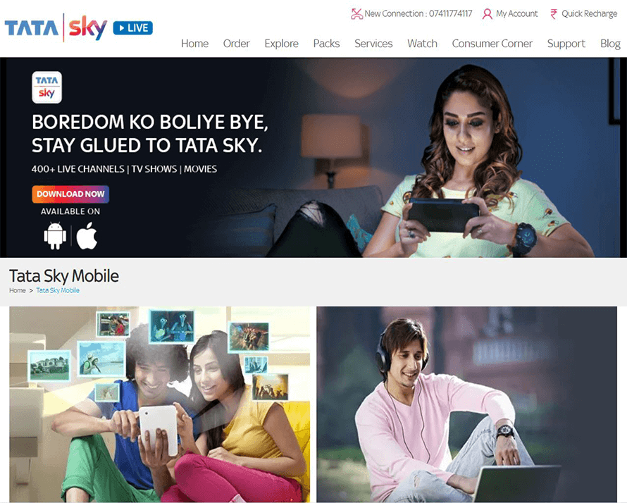
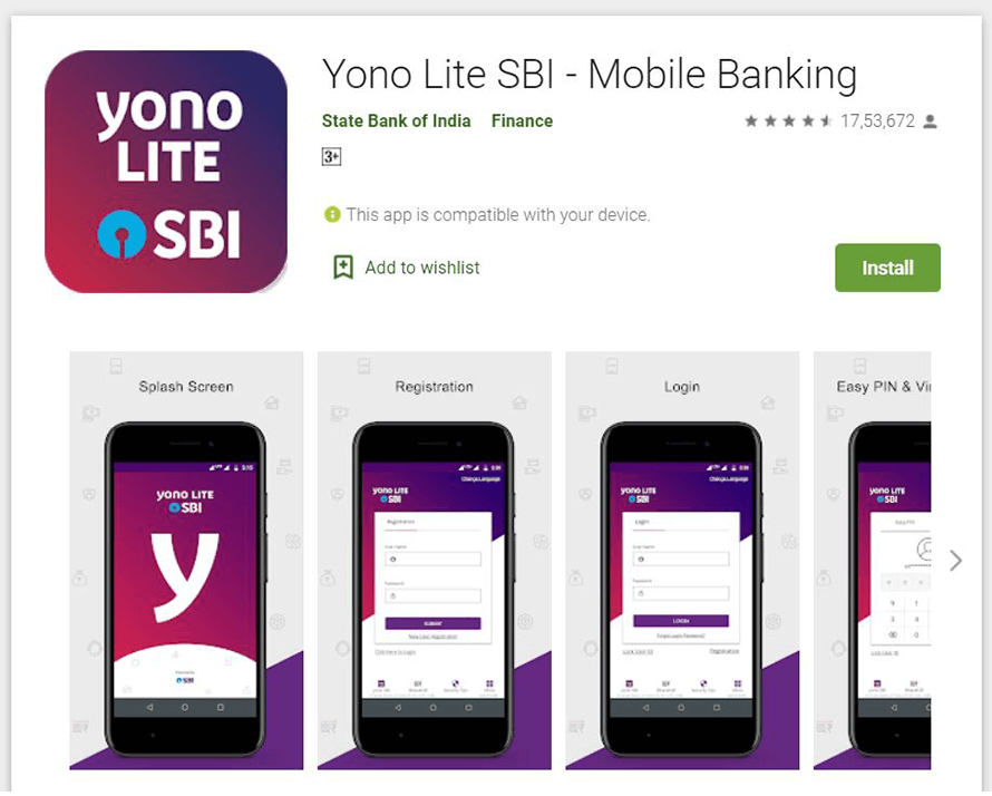
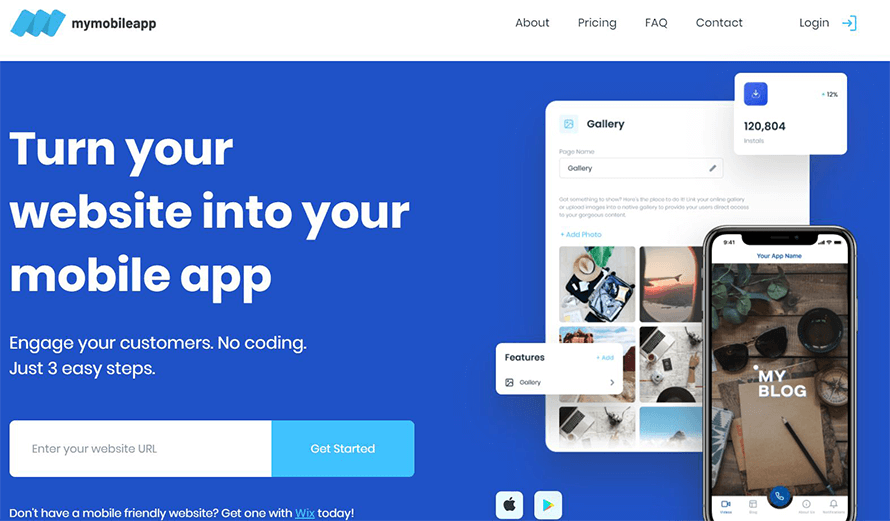
7. Which are some of the most popular mobile apps in India?
Tata Sky Mobile App
SBI Mobile App
My Mobile App
Shareit Mobile App
![]()
Mobile Tracker App
Axis Bank App
IRCTC Rail Connect App
Voter Helpline App
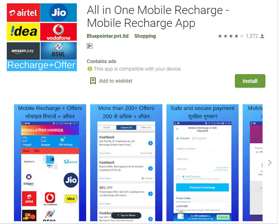
All-in-one Recharge App
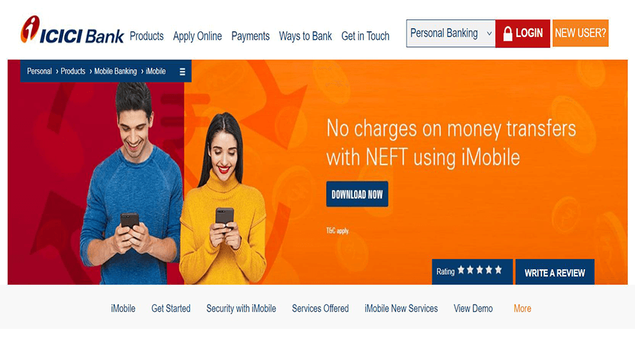
ICICI Bank i-mobile App
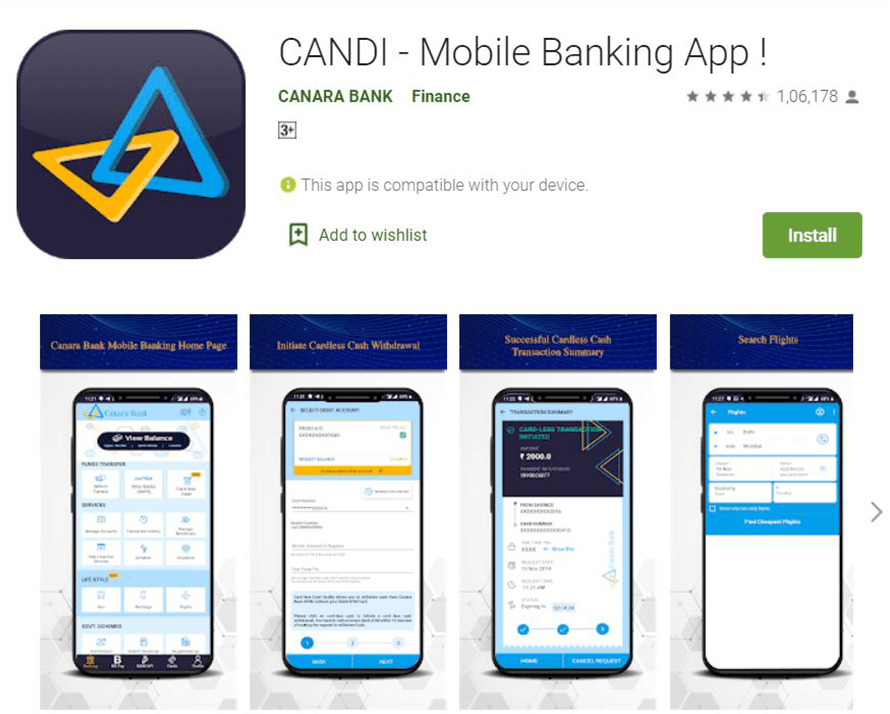
Canara Bank CANDI App
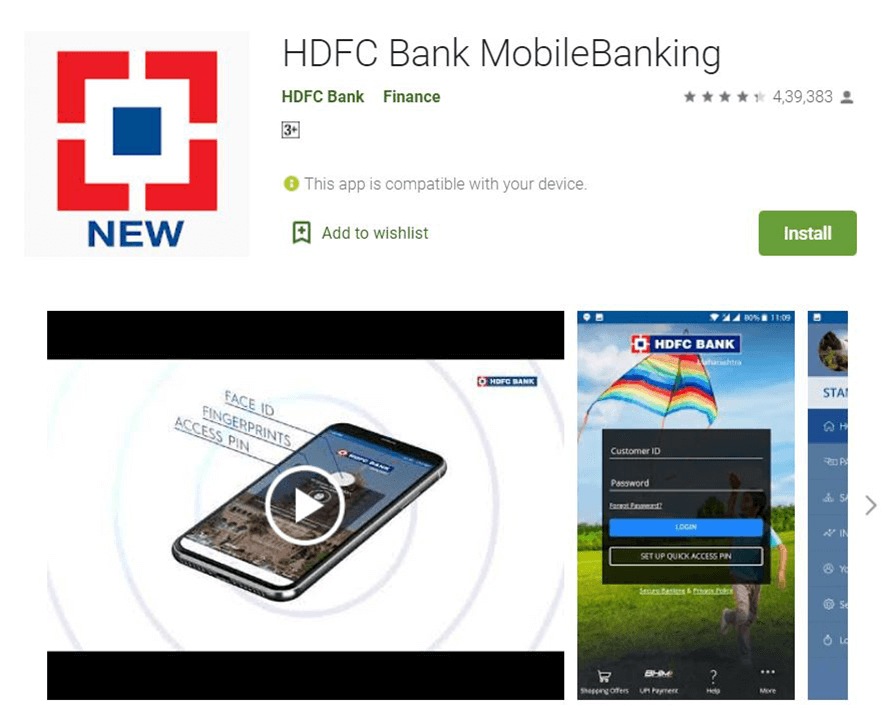
HDFC Banking App
PUBG App
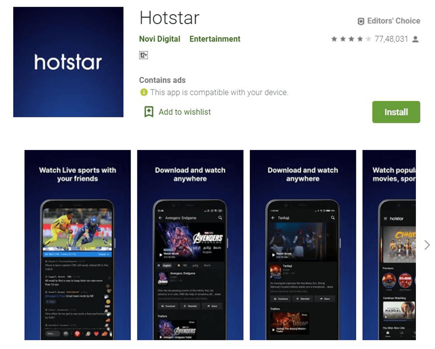
Hotstar App
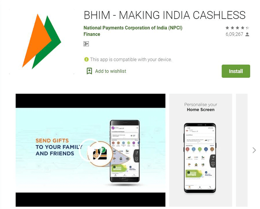
BHIM UPI App
About Kodework
Kodework is a global leader in mobile app design. Our team of experienced mobile app designers work with clients across Europe to simplify human-screen interactions. We pride ourselves on delivering seamless user interface design, user experience design, mobile UI design, dashboard design and web design.
When it comes to employing the best UI UX and mobile app designers in the country, Kodework leads the way. We are the top company for career growth. For our clients, we deliver business growth and brand building via UX UI prototyping tools, design techniques, adopting the latest UI/UX trends and turning UI/UX needs to successful case studies.
The Kodework mobile app blog covers topics, such as mobile app prototyping, usability, architecture, interaction, process, research, styles, news, trends, tips, strategies, successful case studies etc.
Kodework works with Nordic Intent, Creometric, Ninestack and Fathamster Studio to serve B2B, B2C and B2E customers’ needs.
