Ahh colours. Our early differentiator. The one thing that helps us choose, relate, communicate, act-upon, emote-to, judge, and reward.
Colours influence purchase decisions. Most brands associate themselves with multiple colours. At Kodework, our web design team brainstorms colours to determine which would work best as a driver for branding strategy.
Colour psychology plays a big part as well. The audience is drawn to certain colours on a website or app. A call-to-action (similar to the one at the end of this post) needs to match the brand and be alluring enough to make a user click.
This makes colour palettes so important when designing a product, website or app. But what is the secret behind creating a relatable and strong colour palette? Let’s find out.
Choosing the colours for the palette
Choosing appropriate colours for your palette is a real challenge for product designers. The product must be accessible to personas of all colour vision deficiency (CVD).
A textual contrast check is mandatory. This needs to be done before any coloured text is set over a colour in the background.
Once the CVD issue is tackled, our team of UI designers then decode the various sets of colours and its principles. This makes life much easier.
We feel that it takes as much as 90 seconds to judge the success of a digital product. That is why colour plays an important role as the first line of user perception. Add to that user demographics and probable product placements.
Colours help choose products
Colours carry emotional value. They emote feelings and perception. The widely believed predicament for colours are,
- Red colour symbolizes passion, power
- Blue colour symbolizes confidence and intelligence
- Yellow colour symbolizes happiness and intellect
- Green colour symbolizes growth and ambition
- Black colour symbolizes mystery and elegance
- White colour symbolizes purity and perfection
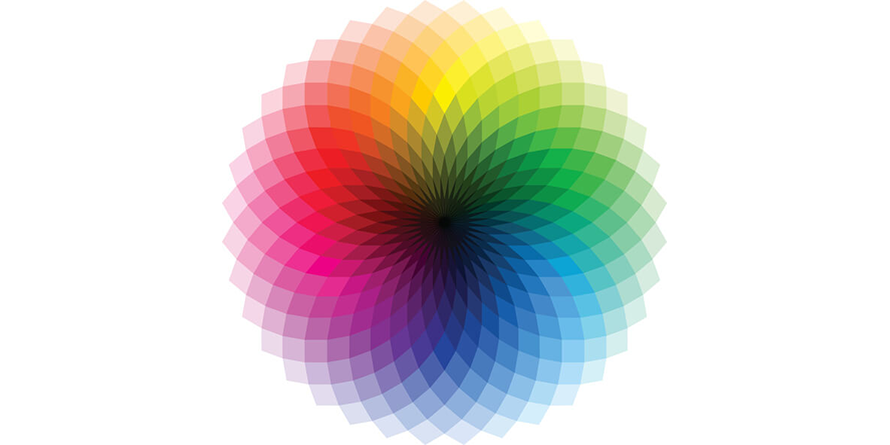
Designers can use this as a colour wheel and go about designing the palette. A colour wheel or a colour circle is an illustrative setup of colours and hues around a circle. It depicts the relationship between primary, secondary and tertiary colours.

Fresh branding for a product requires resonating an emotional connect. Monochromatic or complementary colour palette can work.
Next, the product guidelines, limitations and directions can influence certain colours. For example, Microsoft and Google maintain a strict colour template.
Lastly, the intent of the product, the value it provides, the users being targeted, and mental models all come into picture.
The colour schemes of a palette
There are four common colour schemes that help set a colour palette. These schemes are all created using a colour wheel.
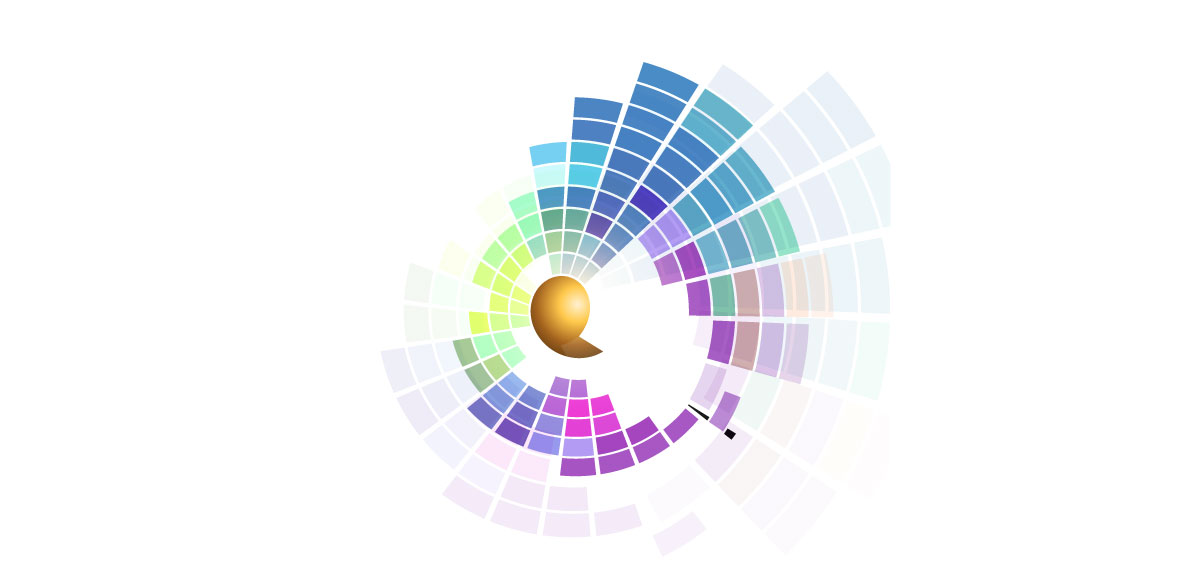
Triadic colour schemes are made up of three colours. They sit triangular from each other on the colour wheel. Setting up this scheme is simple. Choose a base colour, draw an equilateral triangle across the colour wheel to get to the other two colours.
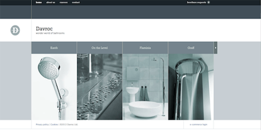
Monochrome colour scheme is solely based on one base colour. It includes various hues and shades of that same colour.

Image Courtesy – Davroc
Complementary colour scheme uses two colours. These colours are from the opposite sides of the colour wheel, and hence complementary. The scheme uses various shades of the original complementary colours.
 Image Courtesy – HUGE
Lastly, Analogous colour schemes make use of three colours that are set to close to each other on the colour wheel.
They create a cohesive look throughout the design. Mix and match to see which are the three colours that go
together.

Image Courtesy – Insurance Jack
Creating the perfect colour palette
Now that we understood the importance of colour palettes in design and what colours make up the schemes, let’s create a colour palette that will make your design standout.
Step #1 – Select a base colour
Start with a colour palette with a base colour. It could be the colour taken from the branding guidelines. Choose a strong emotion, something that’s associated with your brand.
The base colour is always the starting point. There are tools available such as Paletton which finds the perfect shade for the base colour.
Step #2 – Select a colour scheme
The next step is to choose a colour scheme. You can come up with your own colour scheme or pick from the colour schemes mentioned above.
The idea is to not get overwhelmed with too many colour options. Focus on what the user will feel when viewing the product or website.
Step #3 – The colour palette SECRET
Well, we wouldn’t let you go without revealing the secret, shall we?
Use your colour palette for every design element within your website or product landing page. Try blending the palette to the real images that go on your website.
Images can bring out the best out of your design visually. Fit those images to your colour palette and you are good to go. If you are stuck, try a colour palette generator. You can try one from Canva.

Image Courtesy – Canva.com
If you are looking to add vibrancy to your poorly designed website, let us help you.
Click on the ‘BRIGHT BLUE BUTTON’ below and get on a FREE consultation with our design experts.
Also, if you are a Business looking to PARTNER, Freelancer looking to WORK WITH US, or just interested in knowing more about what cool things we do, go to KODEWORK.COM
