Preface
Web design needs more than; writing an algorithm, setting up pages, and going live. A good web design comprises general principles, frameworks, theories, and some good old brainstorming. Web design differs from mobile app design. Understanding what makes them different in functionality is important.
This lengthy, but informative web design guide will also shed some light on some top web design practices to adopt.
Looking for a smart re-branded website design to attract more leads? What about user-friendly mobile app design? Call +91 750 620 3013 or write to [email protected], for getting in touch with our team of experienced web developers in Norway or India.
Some commonly asked queries that will be covered in this web design guide are,
“What is responsive web design?”,
“How to design a web page?”,
“Which is the best web design software?”
Kodework works for clients all around the world. We pride ourselves in providing seamless web design and web development solutions. Whether you are a beginner or an expert, this guide benefits everyone.
Let’s dive right in…
What is web design?
In simple terms, the web design focuses on the interaction between a user, a client (web server) and a website/webpage. It tries to ascertain how easily you can browse through various pages over the web.
But then, aren’t mobile apps connected to the web as well?
We feel the web is more open when it comes to design. Mobile UI design focuses on a stricter design standard (based on the OS of course). This makes it easier to design for mobile. A web designer must keep an eye out for UI features. There shouldn’t be too many shadows or gradients that could slow down the page or website.
“Digital design is like painting, except that the paint never dries”
– Neville Brody
What is a web design framework?
A web UI design framework aids the speedy development of website design. Making use of a framework, developers can build responsive and beautiful designs without necessarily needing advanced technical skills.
A good web UI framework should contain the following functionalities:
- It should preferably be open source
- Being open-sourced means, free as well
- Should be supported by a large community of developers
- A good framework should be customizable as per project design needs
- The framework should support all browsers
- A good framework should enhance all important HTML elements
Check the difference between web design and web development by CareerFoundry
Why do we need web design?
Web design is a complicated concept. Our guide to UI UX design already covered every possible aspect related to UI UX design. Don’t look at web design as a combination of buttons, screens, and pixels. Look at them as any task that needs to be started, monitored midway, and finished.
Suppose, you want Kodework’s UI/UX team to design a homepage of your brand-new website. Every click, scroll, hover, associated with the homepage will be treated as a task. A web designer/developer will take each task and complete it.
If there is a button to be clicked on the page, the start of the task would be to figure out what are the calls or indications that will make anyone click on the button. Once clicked, what will be the result of that clicking. That is another task altogether with a start, middle and finish.
Web UI allows UI designers/developers to create an engaging web design, through which a user can interact better within a logical flow. Otherwise, everything would be haphazard and without any sensible flow.
“If you think math is hard, try web design”
– Trish Parr
What is MAYA principle in UI design?
The goal of any UI UX designer would be to design the most original and out-of-this-world design for their users. While that is a good expectation to have, the MAYA principle offers to look at it as more of a ‘check & balance method’.
This methodology was coined by Raymond Loewy. M.A.Y.A stands for ‘Most Advanced Yet Acceptable’. The principle explains that the general user is resistant to any sudden change. Therefore, new innovations are not necessary even if it is for the betterment of a design. This does not mean that a web development or website design should not be innovative or push boundaries of design upgrades. This principle only reiterates that a good UI design must
- Produce relevant scope – There is no need to reinvent a process. Any unwanted additions to the design only add to the confusion for the user. The changes that are incorporated to make the design better must be worth it.
- Lead to visual metaphors – The changes that are being added to web design, need to relate to the user’s day-to-day activities.
For example, the concept of scrolling or sliders were introduced to resemble the flipping of a page while reading a book.
- Be based on traditional options – Not all users enjoy the same comfort levels. There should be an option for new users to also have the option of opting for a traditional view or function.
Kodework tip: Anticipate mistakes!
What are the best web design practices?
User Interface design is all about anticipating what a user will do and ensuring he/she has access to the right elements to complete the action. UI design combines visual design, information architecture, and interaction design. Web UI design must maintain consistent and predictable choices in the design layout. This ensures there is efficiency, user satisfaction and task completion. The choices such as dropdown lists, toggles, radio buttons, checkboxes, and text fields need to be consistent.
The same also goes for sliders, search fields, icons, tabs, progress bars, message boxes, notifications, tooltips, and modal windows. Multiple elements are useful to save space. The interface elements must not make the user guess too much as to what could happen if the dropdown is selected.
Some top web UI design practices to follow are:
Keep in mind the spatial relationship between elements. Carefully placed elements can draw the user’s attention to the most important areas of the page/site. This also improves readability.
The usage of textures and color is important. The use of gaudy colors can take the user’s attention away from an effective CTA. Make use of light, contrast, and texture to your advantage.
Typography helps create clarity and sets up a hierarchy. Typeface usage is key. Understanding fonts, font sizes, and font arrangement increase the readability, legibility, and scan-ability of the design.
Keep in mind instances where the user needs to be informed of any errors or a change in state. Preventing user frustration is key. Pre-chosen fields or drop-down with logical options save time and ensure user retention.
Breadcrumb trails, headings, and menu items maintain orientation. The user feels comfortable knowing where he/she is located on the page.
Good content complements the web page’s navigation. Menus, breadcrumbs, links, and filters are just some navigational elements where the presence of good content is crucial.
Kodework Tip: Never ignore UI standards
Links build a connection between relevant content, breadcrumbs provide a reference point, menus are the first place a user would navigate to, and filters make a content-heavy website manageable.
Click or scroll? Scroll or toggle? These choices make navigation a must-have in any web design. Horizontal navigation allows the user to navigate from left to right. Vertical navigation is best for storytelling. Vertical navigation also makes single page websites highly functional.
Animation, within UI design, must not be ignored. The human eye is drawn to movement and can be used to improve the look-and-feel of the webpage. An animated icon works better than a flat icon. The web page becomes more coherent through the use of transitions. The speed of the animation must not be too fast as to confuse the user.
Links that are provided onto the web design must be well spaced to allow easy clicking. A top-level menu with submenu links is a great idea. Hovering above the top link then displays a submenu option. This allows quick access to all possible menu links on the website. The drawback here, however, is the problem that users with poor vision will suffer with, due to small-sized fonts.
The parallax background scroll encourages interaction thanks to the background images changing to provide a visual storytelling feel.
Which are some common web design elements?
It’s imperative to consider both functionality and visual appeal of a website. Integrating both these elements in the design can help maximize the performance of the website.
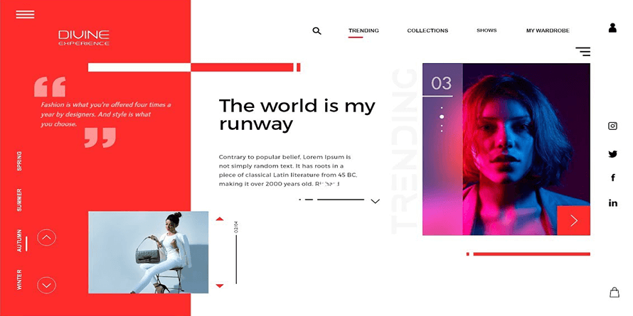
Visual elements
Visual elements combine fonts, written copy, spacing, and much more. Let’s break down some essential visual elements within web design
Visual element – Text
The look and feel of any website go hand in hand. They should never be considered as separate entities. The text must be written with the audience in mind. It’s a good idea to let a content writer prepare the copy for websites.

Visual element – Font
When designing a website, keep in mind the easy-to-read fonts. Fonts complement the design of a website.
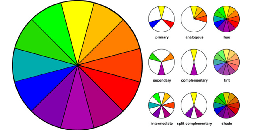
Visual elements – Colours
Colours are essential in visual web design. There are numerous misconceptions about incorporating the psychology of colour. The emphasis should be on aligning the colours of the website, and the company branding.
Visual elements – Layout
Choosing the website layout is essential to both functionality and appearance. Kodework’s UI UX designers keep in mind the various layout principles when designing a website.
Visual elements – Shapes
Using graphical elements in web design isn’t new. Combine beautiful shapes and colour to direct or grab the attention of website visitors. The biggest challenge arises when establishing website shapes without relying on code.

Visual elements – Spacing
There is always space between the images, lines, or paragraphs. As a rule of thumb, maintaining too much space is significantly better than crammed elements. Whitespace is a tactic that needs to be considered by web designers.
Visual elements – Icons & images
Great web designs can communicate without words. One way to accomplish this is by using powerful icons and images. Stock images found online are one way to find images. Real images that connect website sections well, work best.
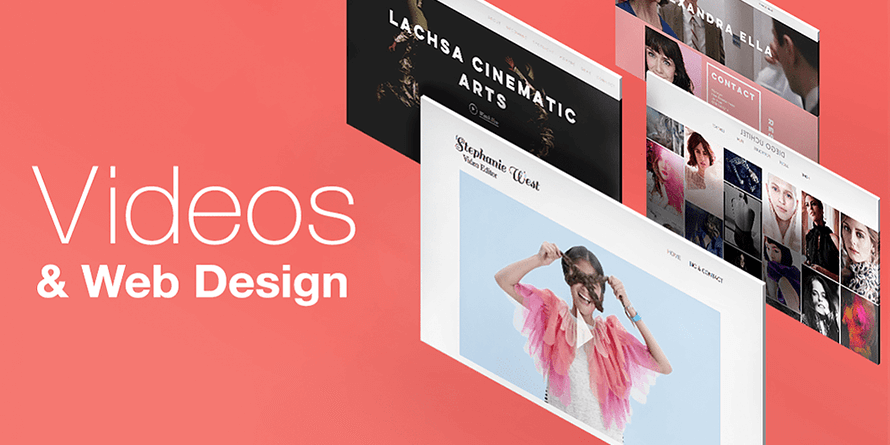
Visual elements – Videos
Videos are increasingly becoming a trend. When used smartly, they can convey a powerful story. Website visitors can experience something unique and engaging without the use of chunks of text. Videos can be distracting though, and must be aligned to your service offering.
Functional elements
Functional elements are added to web design to aid the visitor in website navigation, loading the webpage faster or understanding relevant animation.
Functional element – Navigation
Navigation is an important component that determines how the website works. Depending on the website audience, web designers must create navigation that serves multiple purposes. First-time visitors need to understand what your website talks about. They must be guided around the numerous links, icons, sub-links, and folders.
Functional element – Loading speed
We appreciate a quick loading website. Nobody wants to land on a website and wait for it to load. This is especially the case when loading the website on smartphones. Even if the website looks super-amazing, but takes ages to load, your web designer has failed. Slow-loading websites are also penalized by Google. Content must be compressed to maximize load times.
Functional element – Animation
Web animation is a key criterion when trying to grab the user’s attention. Whether directing users to a call-to-action or breaking down a tutorial into easy steps, animations play a big role. Complex animations require the services of an animation developer as well.
Functional element – User interactions
Website visitors can interact with your website in numerous ways. They do this through typing, clicking, and scrolling. The best website designs can simplify user interactions, letting the user feel that he/she is in control. Keep these Kodework tips in mind though.
- Make website forms mobile-friendly
- Never auto-play videos on the website
- Don’t underline text unless clicked-on
- Try to avoid pop-ups that distract
- Make sure scroll-jacking is avoided
Functional element – Site structure
A website’s structure can make or break the website’s user experience. If users land on your website and are confused, then chances are that the crawler will be confused too. Numerous free website site builders are available for use. Developers can make use of them for laying out pages.
Functional element – Cross-browsing
A fantastic web design should work on all browsers or devices. Developers test this cross-browsing feature through cross browsing testing tools available online. This is a tedious process but makes the website more efficient.

Which are the different types of website design?
The usual website design types are static, fixed or fluid. Now, the two most widely designed websites are either responsive or adaptive.
Adaptive web design
In adaptive web design, two or more variants are designed. These variants are customized for different screen sizes. Adaptive web design is further split into – device type adapt or browser width adapt. For device type adaptation, the website knows what device type version to display to a browser/client. The only drawback here is that if the browser window is shrunk on a desktop, the web page design won’t adapt to the shrunk version.
For browser width adapts, the website makes use of breakpoints and media-queries to switch between browsers. Instead of the device type, such as mobile, tablet or desktop, dimensions such as 480px, 768px and 1080px are designed. The latter provides better flexibility and is more responsive to changes in browser size on a larger screen.
Adaptive web designs are custom designs that are easier to build. Care must be taken when viewing them on smaller browser windows.
Kodework Tip: Adaptive websites can also contain responsive elements.
Responsive web design
Responsive web design combines breakpoints (media queries) with flexible grids. This creates a custom look for every screen size possible. Responsive websites constantly change according to screen sizes. Adaptive websites, on the other hand, adapt only when hit with a breakpoint. They combine great experience at every screen size. This is regardless of the device type. They are built rigid, making them hard to break. Several templates are available online for the same.
Adaptive websites need extensive testing for quality maintenance. Without access to its codes, they can be challenging to improvise on.
About Kodework
Kodework is a global leader in web development. Our team of experienced web developers work with clients from across Europe to simplify human-screen interactions. We pride ourselves on delivering seamless user interface design, user experience design, mobile UI design, dashboard design and web design.
When it comes to employing the best UI UX designers in the country, Kodework leads the way. We are the top company for career growth. For our clients, we deliver business growth & brand building via UX UI prototyping tools, design techniques, adopting the latest web development trends and turning web needs to successful case studies.
The Kodework web development blog covers topics, such as prototyping, usability, architecture, interaction, process, research, styles, news, trends, tips, strategies, successful case studies etc.
Kodework works with Nordic Intent, Creometric, Ninestack and Fathamster Studio to serve B2B, B2C and B2E customers’ needs.